
NAI logo and poster
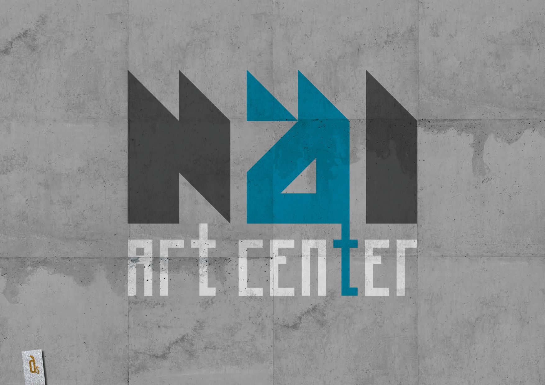
A proposed identity and poster for the NAi in Rotterdam, drawn straight from the building it lives in.
The NAi (Nederlands Architectuurinstituut) is Rotterdam's architecture institute. This was a design proposal for its logo and poster, put forward alongside a reworked interior — one gesture rather than three separate jobs.
The building did most of the arguing. Its own design is minimal and cubic, and exposed concrete runs through and around it. Rather than dress that up, the identity leans into it: same restraint, same hard edges, same grey honesty.
So the logo and the poster take their cue from the architecture instead of competing with it. For an institution devoted to buildings, letting the building set the tone felt like the only defensible starting point.
It stayed a proposal. I still think the concrete was right.
When the building is already this good, the logo's only job is to get out of the way.